Thursday 29 December 2011

Update: Beeton Final Piece Ideas

So, I need to form a body of work based on Mrs Beeton. This work will have to be presented in a style of my choice, this is an idea that I am currently running with for the final piece.

I am planning to produce a hard back, hand bound book of original Mrs Beeton recipes to be contrasted against modern day recipes for the same, or similar, products. (If possible I would like to use my own family recipes. I am planning to show the differences in the following.
  • Writing Style
  • Font
  • Paper (Colour & Texture)
  • Illistrations VS Photographs
  • Cooking Style
  • Recipe Method
I will be looking at a range of modern cookery books alongside an original Mrs Beeton's Household Management that has bean loaned to me for use on this project. I would like to use a paper similar in texture and colour to the one used in the Mrs Beeton Books and a printing method close to the one used, e.g. Type Writer. In turn I would like to use a professional printing service so that all modern recipes, method and photographs can be printed on to the glossy paper found in cookery books nowerdays.

Quick Book Sketch:

I have looked at various different binding methods for the final book (these designs can be found in my sketchbook). However, I am still drawn to the simplicity of the ordinary, everyday hard back book, it can relate to both the cookery books of Mrs Beeton and most of the modern day chef's. In the image above I have also looked at the differences in paper and how this would be presented, again, this can be found in my sketchbooks. I will show another book binding design in a later post.

Presentation Idea:
For the final peice I have planned to produce a range of different edable products taken from original Mrs Beeton recipes and contrast them against modern day products (all home made). I would also like to look at the range of recipes found in the M.B.B.O.H.M and how her life experiences are reflected in her cooking. (Cheap cuts of meat as well as the best cuts & Substitutes for expensive ingrediants) For this I would like to possibly form some kind of "Taste Test" and find out from my classmates which they prefer, new or old. I would also like to make some ceramic jars, bowls, plates etc that can be used for this and included in  to the final outcome.

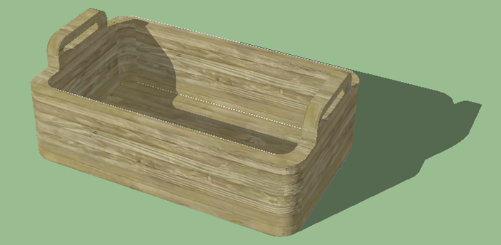
(Above - 3D sketch of presentation box)
I would like to gather the ceramic items and edable goods and place them in a box similar to the drawing above which will be lined with hay or shreaded paper. The box decoration would be split in half, modern/old, a partition may also be included to split the old recipes produced from the modern ones.

Possible Contents Ideas:
  • Jams or preserves
  • Bread
  • Cake
  • Sandwich
  • Bottled sauces
  • Bottled drinks
  • Blanket
  • Cutlery
  • Plates
  • Dishes
  • Table decorations
  • Maps
  • Many Many more depending on final idea.
I am currently torn between the following ideas/themes.
  1. A picnic hamper containing the book, cutlery, handmade ceramics and edable products taken from the Mrs Beeton book
  2. A picnic hamper containing the book, cutlery, handmade ceramics and edable products, Beeton based modern recipes.
  3. A picnic hamper containing the book, cutlery, handmade ceramics and a taste test, modern vs old.
More planning and then the final decision, wish me luck.

-Dan

Thursday 8 December 2011

Me & Mrs Beeton

For my new project I will be focusing on the life of Mrs Isabella Beeton and forming a body of work based around her. For this project I will be looking at the following.
  • Mrs Beeton
  • Mrs Beeton Books
  • Mrs Beeton Original Recipes
  • Eales Family Recipes
  • Book Binding
  • Home Made/ Recycled Paper
  • Illustration
  • Photography
  • Font
  • Graphic Design
And anything else that I can link to the use of books and the amazing world of Mrs Beeton.

Sunday 13 November 2011

Wacom (Bamboo) Tree no. 1


My first colour digital painting inspired by a picture taken earlier this year.

Wednesday 9 November 2011

Friday 28 October 2011

Muybridge

Edweard Muybridge - Born Edwards James Muggeridge
Born: April 9th 1830 - April 8th 1904 (Aged 73)
From: Kingston Upon Thames, England

"In 1872, former Governor of California Leland Stanford, a businessman and race-horse owner, had taken a position on a popularly-debated question of the day: whether all four of a horse's hooves are off the ground at the same time during the trot. Up until this time, most paintings of horses at full gallop showed the front legs extended forward and the hind legs extended to the rear. Stanford sided with this assertion, called "unsupported transit", and took it upon himself to prove it scientifically. Stanford sought out Muybridge and hired him to settle the question."-Wikipedia

Below is the outcome of this debate that shows the way a horse runs. I have found Muybridge's work inspirational throughout the Three Little Words project, especially for the word Jumping. If possible I would like to work in a similar way using humans as the subject matter.

File:Muybridge race horse animated.gif
Above: A Horse in Motion
Above: American Bison Cantering


Wednesday 19 October 2011

Artist of the Day: Andy Warhol

"Andrew Warhola, Jr. (August 6, 1928 – February 22, 1987), known as Andy Warhol, was an American painter, printmaker, and filmmaker who was a leading figure in the visual art movement known as pop art. After a successful career as a commercial illustrator, Warhol became famous worldwide for his work as a painter, avant-garde filmmaker, record producer, author, and member of highly diverse social circles that included Bohemian street people, distinguished intellectuals, Hollywood celebrities and wealthy patrons.
Warhol has been the subject of numerous retrospective exhibitions, books, and feature and documentary films. He coined the widely used expression "15 minutes of fame." In his hometown of Pittsburgh, Pennsylvania, The Andy Warhol Museum exists in memory of his life and artwork." - Wikepida


"The highest price ever paid for a Warhol painting is US$100 million for a 1963 canvas titled Eight Elvises. The private transaction was reported in a 2009 article in The Economist, which described Warhol as the "bellwether of the art market." $100 million is a benchmark price that only Jackson Pollock, Pablo Picasso, Vincent van Gogh, Pierre-August Renoir, Gustav Klimt and Willem de Kooning have achieved." - Wikipedia


I am a fan of Warhol's work, when I first saw it I knew that I wanted to try doing the same thing but in my own way. During my Foundation Diploma year I used a variety of techniques that I had seen Warhol use but in a digital media and buildings as my subject matter.Although I like his works I do not see who would buy the piece above for $100 MILLION, thats crazy, clearly more money than sense. I a sure i will continue to use Warhol as an inspiration through my artistic career.


Tuesday 18 October 2011

3 Little Words: Tree-Train Style

Today on my train ride home from Banbury I decided to play around using the movement of the train, the trees in the landscape outside and my trusty mobile phone to take the pictures below. I aim to work with these images over the next few weeks to produce a variety of paintings using different media.


I personally like the images taken when the train was at speed, I think they could make some interesting paintings, prints or even stitch work. We will soon see. 

Square, Circle, Trangle: Train Style

Just a few images I have collected from my train rides to and from Banbury. Its mostly signage but it has shown me that there is a correlation between colours, both primary and secondary, an these three shapes.

Yellow triangular warning sign.

Red circular no smoking sign.

More yellow triangular warning signs.

Yellow circular button cases.

Blue and white circular litter sign.

Another yellow triangular warning sign.

Some kind of weird bolt that shows a mixture of circles and squares. I have noticed most train staff carry a T-Wrench that will fit in to this slot, I'm guessing to release a door. I have noticed the use of primary colours is to grab our attention to the signs and the meanings behind them.

Series Review - Ceramics: A Fragile History

Episode 1:

Well that was an hour of my life that I will never get back. I was expecting to learn about a specific ceramicist, artist, ceramic legend if you will, instead I saw a series of works made by unknown ceramicists that did not appeal to me at all. The only redeeming feature was the reviews of each different types of ceramics produced and the facts and features that surround them.

Episode 2:

Such a difference from episode one. This was interesting and fun to watch, I have now learnt a lot about ceramics, its "legends", its uses and a few applications. This episode also made me feel a bit sad, it had caught on camera a variety of different run down factories in Stoke-On-Trent where ceramic vases, plates, pots etc still stood on shelves and in storage abandoned as if every worker had just vanished. It also bought the message home of how a group or company's work changes when times get hard. E.G. Wedgwood was one of the leaders of the ceramic scene with new methods of forming ceramics and glazes, he took ceramics to the next level and made it fancy but affordable to the average household. (I will dedicate a post to Wedgwood). The company still exists but all of the products are mostly made across seas where labour is cheaper, this fact alone made me feel that we have thrown away this part of our heritage and dumped on the history of Wedgwood and his ceramics in exchange for a cheaper work force. Guess thats how the world works now.

Episode 3:

Coming soon

Post Modernism: Fluxus

"Fluxus encouraged a do it yourself aesthetic, and valued simplicity over complexity. Like Dada before it, Fluxus included a strong current of anti-commercialism and an anti-art sensibility, disparaging the conventional market-driven art world in favor of an artist-centered creative practice. Fluxus artists preferred to work with whatever materials were at hand, and either created their own work or collaborated in the creation process with their colleagues. Fluxus can be viewed as part of the first phase of postmodernism, along with Rauschenberg, Johns, Warhol and the Situationist International." - Wikipedia
While researching post modernism I cam across the Fluxus art movement. I had heard of this movement before over the past three weeks and decided that this would be a great opportunity to learn a few things about this mysterious movement. Above I have pasted a quote from Wikipedia and used the "Bold" tool to highlight any words or sentences that relate to postmodernism. I found out that some artists that I have looked at before inspired the Fluxus movement and in turn Fluxus was the starting point of postmodernism.

Forge 2:

So, I missed a college trip to the Forge 2 gallery as I couldnt get the day off work. Im hearing mixed reviews about the gallery this morning but it doesnt sound like I missed much. I would check the website for the gallery but have been told its a bit out of date. Ill take a look anyway.

Tuesday 4 October 2011

Marcel Duchamp

Born: 28 July 1887 - Died: 2 October 1968 (Age 81)
Nationality: French - Became a U.S citizen in 1955
Associated With: Dadaist and Surrealist movements
Well known for: A piece entitled "Fountain" which was actually a urinal.
My favourite piece: 
This would have to be "Nude descending a staircase No.2". Although this piece looks cubist and therfor is quite abstract I think you can see the movement of the model coming down the staircase towards Duchamp. I also like how this piece could be a new take on the art tradition of life drawing or painting. I think this is something I would like to try during the next two years, if life drawing is an option.


Saturday 1 October 2011

Square, Circle, Triangle

Unfortunately I missed Wednesday at college due to a hospital appointment. (more on that later) This meant that I missed receiving a brief from Tamar which from what I gather is called "Square, Circle, Triangle" As I have not yet received the brief I thought I would simply Google these words in that order and see what the image results where. Below is my favourite.
I have heard before that there are personality tests of some sort that determine what shape or colour someone is. I like how these three sculptures, that appear to be made from Lego, reflect these tests on human personality. Each being made from a set of primary colour blocks and with the three shapes mentioned in the second test as heads. Something to think about...I must get that brief. Later. - Image from Google

Wednesday 28 September 2011

Shadow Graffiti

I think this is one hell of an idea. Its clever, its aesthetically pleasing, its un-offensive and it washes off! I do not know who this particular artist is but I really like his work. As you can see he waits until night time to walk around his home town with a stick of chalk and draws around interesting shadows caused by street lamps.
However I would like to see what it looks like by the morning when the shadow has gone and all that is left is an outline. Maybe the effect would be lost, maybe it would have its on effect. It seems that the more detailed the source the better the effect.
Although we can not really see this one clearly or close up I think it is highly effective. Again I don't know if the effect would be lost by morning but as it is in the above it is one of my favourite pieces.
Again I think the higher the amount of detail the better the work. However this particular image has given me an idea in relation to the Forensic Portrait work we were set over the summer. I would like to use a backing light to make shadows from each of my items on to black paper, I would then draw a rough outline of each item and its shadow. When all of the items had been roughly traced with pencil I would apply a thin line of glow in the dark paint to each trace, once dry I would charge the paint and hang the picture in a dark space before taking pictures. This is something I would like to try in the near future. Well that is all from me for today, be back tomorrow :) -Images from Google

Tuesday 27 September 2011

New Designs - Future Project

These are three new rough designs for a future project I am working with a friend on. What do you think?


Plant Paint

Okay, so I had a crack at making my own paint this evening. I found a recipe online that required the colouring, 1/4 cup of cool water and 1/4 cup of corn starch. I didn't seem to have any corn starch so I decided to use corn flour instead. I boiled up some stalks from a left over bag of salad (red in colour) and instantly the colour was drained leaving the water an intense red colour. I got the other ingredients ready and mixed them in to a watery paste. I added the colour and to mu surprise I was left with a baby pink slightly thick watery substance that could in no way be used as paint, not even watercolour paint. Since then I have found a new recipe that I will try very soon. Gutted it didn't work. - Dan

Something New

Welcome to my Blog, there is no doubt in my mind that it will look a bit different every time that you visit. (Still messing around with backgrounds, themes, colours etc) I think I will enjoy this a bit more than keeping a PRJ but we will see. Now I'm off to try and make some natural paint, plant paint if you will. Fun times. -Later